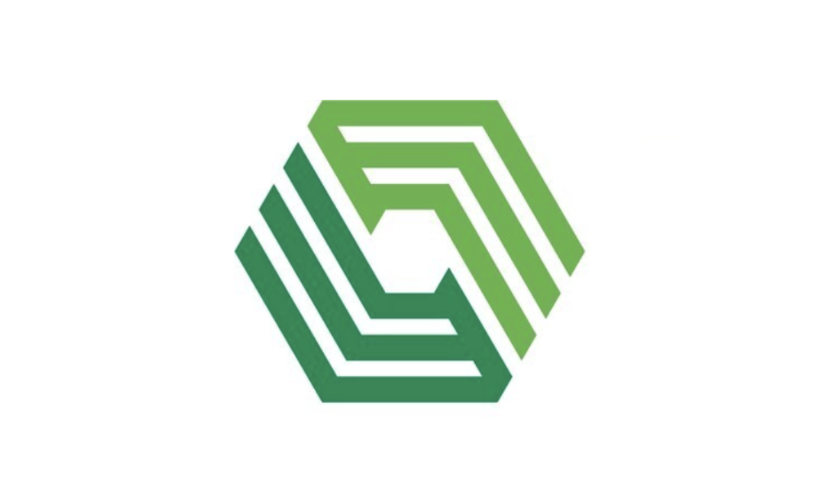
Endries International Inc. is refreshing its corporate brand, including a revised logo, updated brand colors, and refined messaging.
The refreshed logo features an energized icon and modern fonts that “embody the company's focus on service and reliability.” The updated color palette introduces an industrial slate gray-blue alongside a vibrant green, complementing the signature Endries’ green to create a modern look.
“This is the first significant brand update for Endries in decades,” stated CEO Michael Knight. “The new logo draws inspiration from Endries’ 55 years of history, while signaling a path forward which includes the build out of our portfolio of brands.”
Endries will apply the refreshed brand across various channels. The phased rollout will begin with updates to Endries’ digital assets, including a new website rollout later this year, followed by enhancements to physical locations, including facility signage and operational materials. The refreshed brand identity will be integrated across corporate communications, customer portals, and industry events.
“We’ve made strategic investments over the years in complementary acquisitions which include our active brands, Assembly Fasteners, ServTronics, Ace Bolt & Screw, IPC-Rail, Viscan, and StoreRoom Fasteners, all of whom have a strong customer connection in their markets,” Knight added. “This refresh strengthens our leadership position while honoring the legacy of each brand and unifies them under the Endries umbrella.”
Founded in 1970, Brillion, WI-based Endries distributes 800,000 SKUs, including standard and engineered fasteners, through 26 distribution centers across North America and Europe.